How Colour Analysis is Shaping the Future of Personalized Travel Experiences

The resurgence of seasonal colour analysis, a fashion methodology that gained peak popularity in the 1980s, is currently undergoing a digital transformation, moving beyond the confines of wardrobes and into the multi-billion-dollar global travel industry. Originally popularized by Carole Jackson’s 1980 bestseller Color Me Beautiful, the system categorizes individuals into four seasonal palettes—Spring, Summer, Autumn, and Winter—based on the natural undertones of their skin, eyes, and hair. While once reserved for choosing lipstick shades and silk scarves, this aesthetic framework is now being utilized by modern travellers to curate "harmonious" vacations, matching their personal palettes with the geographical and architectural hues of global destinations.
The intersection of personal aesthetics and tourism reflects a broader shift toward hyper-personalization in the travel sector. As social media platforms like TikTok record billions of views for the hashtag #coloranalysis, travel consultants and operators are observing a new demographic of "aesthetic travellers" who seek destinations that not only offer cultural enrichment but also provide a visual backdrop that complements their natural features. This trend is rooted in the psychological desire for "visual harmony," a concept that dates back to 19th-century Impressionist painters who studied how natural light shifts across the seasons to alter the perception of colour and form.
The Historical Evolution of Seasonal Colour Theory
The concept of seasonal colour analysis is not a modern invention but a synthesis of art history and 20th-century psychology. In the early 1900s, Swiss painter and teacher Johannes Itten, associated with the Bauhaus school, noticed that his students produced better work when using palettes that matched their own natural colouring. This observation laid the groundwork for what would eventually become a retail phenomenon in the 1980s.
Carole Jackson’s 1980 publication streamlined these complex artistic theories into four accessible categories. The "Summer" and "Winter" palettes were defined by cool blue or pink undertones, while "Spring" and "Autumn" were characterized by warm golden or peach undertones. Following a period of dormancy in the 1990s and 2000s, the trend saw a massive resurgence around 2022, driven by Gen Z’s interest in "personal branding" and the development of AI-powered filters that allow users to perform self-analysis in seconds.
The Summer Palette: Muted Tones and Gallic Sophistication
For individuals identified as "Summer" types—characterized by cool, muted, and light tones such as ash blonde hair and grey-blue eyes—the travel industry is pointing toward the soft landscapes of Western Europe, specifically France. The Summer aesthetic is defined by low-contrast colours, mirroring the hazy, diffused light of a July afternoon in the northern hemisphere.
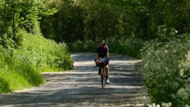
Destinations like Provence and Normandy offer a visual environment that aligns with this palette. In Provence, the silver-green of olive groves and the dusty purple of lavender fields provide a backdrop of muted cool tones. Similarly, the coastal commune of Deauville and the gardens of Claude Monet in Giverny offer the "soft pastel" environment that complements the Summer complexion. Industry data suggests that "slow travel" experiences, such as cycling tours through the French countryside, are particularly popular among this demographic, as the pace of the trip matches the "languid and laid-back" nature associated with the Summer seasonal type.
The Autumn Palette: Earthy Hues and the Moroccan Hinterland
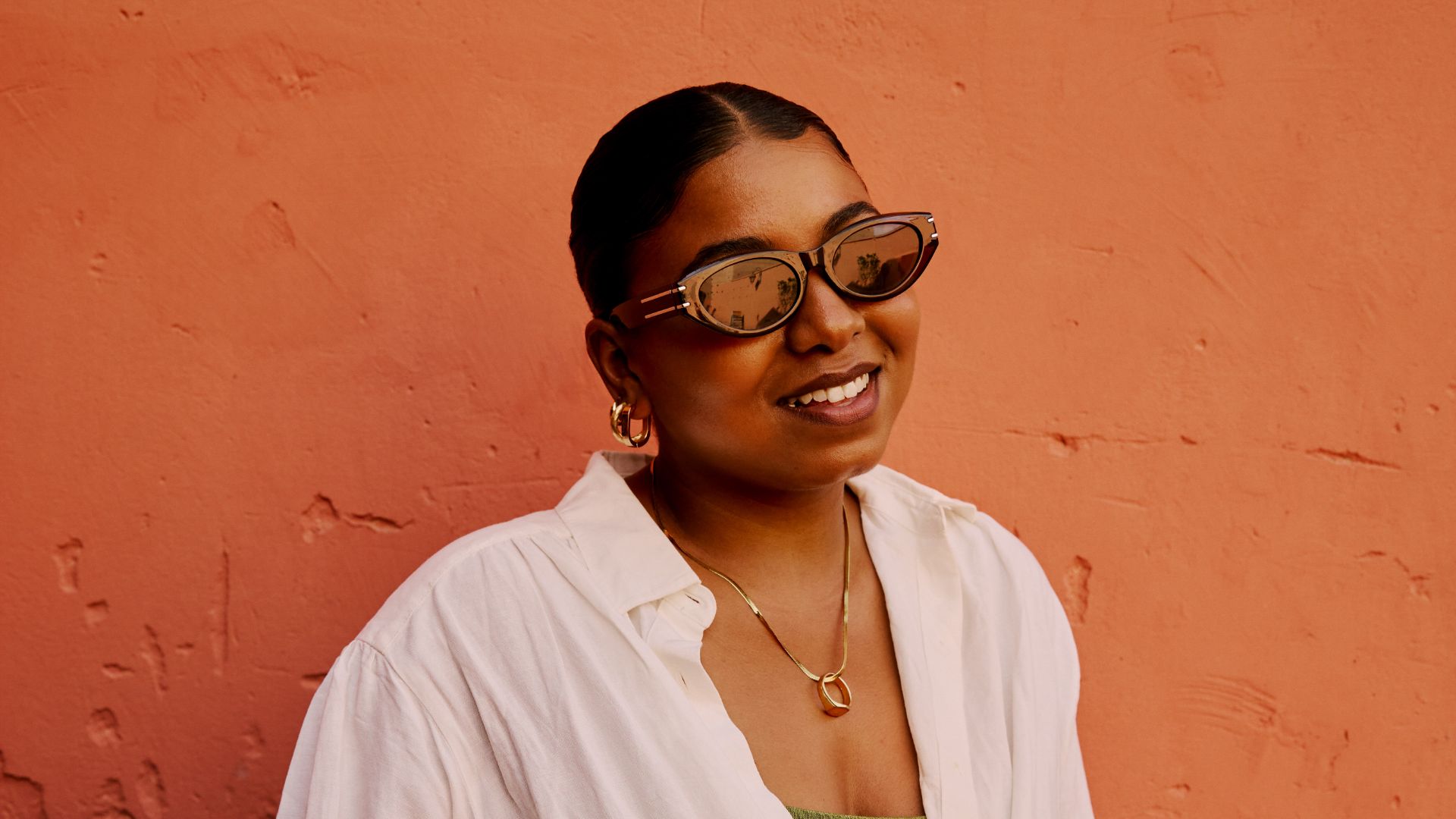
The Autumn palette is defined by rich, warm, and dark hues. Individuals in this category often possess golden, copper, or chocolate-brown hair and skin with warm, melanin-rich undertones. The visual environment that best suits this group is one of high saturation and earthy depth, making Morocco a primary destination for "Autumn" travellers.
The architectural landscape of Morocco, particularly the UNESCO-listed Fes el Bali medina, is dominated by ochre, terracotta, and burnt sienna. The Sahara Desert, with its rust-shaded dunes, provides a high-saturation environment that mirrors the Autumn person’s natural warmth. Tourism boards in North Africa have noted a rise in "golden hour" tourism, where itineraries are specifically designed around the period shortly before sunset. For the Autumn traveller, this lighting provides the optimal conditions for photography, as the warm light enhances the golden undertones of their skin and eyes.
The Winter Palette: High Contrast and Icelandic Drama
Winter types represent the highest level of contrast in the seasonal system, typically featuring cool-toned skin paired with dark hair and striking eye colours. This is the only palette that can effectively carry "stark" colours like jet black and pure white without appearing washed out. Consequently, the stark, dramatic landscapes of Iceland are being marketed as the ultimate Winter destination.
Iceland’s geography—defined by the deep black of volcanic sand, the brilliant white of glaciers like Solheimajokull, and the vivid "jewel tones" of the Aurora Borealis—matches the high-saturation requirements of the Winter palette. The "Golden Circle" and the geothermal waters of the Secret Lagoon offer a high-contrast environment that reflects the "mystery and drama" of the Winter aesthetic. Analysts suggest that the rise of "coolcationing"—the trend of seeking colder climates to escape global heatwaves—has intersected perfectly with the Winter colour trend, leading to record-breaking tourism numbers for Nordic countries.
The Spring Palette: Vibrant Warmth in Portugal and the Azores
Spring types are characterized by "clear" and warm colours. Unlike the muted tones of Summer or the earthy depths of Autumn, the Spring palette is bright, featuring coral, peach, and vibrant yellows. This aesthetic finds its geographical match in the colourful architecture and lush floral landscapes of Portugal.
From the yellow-hued medieval villages of the Douro Valley to the vibrant tiles (azulejos) of Lisbon, Portugal provides a "fresh and blossoming" environment. The Azores, a nine-island archipelago in the mid-Atlantic, further caters to this palette with its lush green hillsides and bright flora. The "Spring" traveller is often drawn to destinations that feel "fresh and energetic," leading to increased interest in the Azores’ hiking trails and pineapple plantations, where the natural vibrancy of the environment complements the traveller’s warm, golden undertones.
Data and Market Analysis: The Rise of Aesthetic Tourism
The shift toward colour-coded travel is supported by emerging data in the experience economy. According to a 2023 consumer report, 76% of travellers now consider "social media shareability" as a primary factor when choosing a destination. Furthermore, the global personalized travel market is projected to grow at a CAGR of 7.2% through 2030.
Travel companies are responding to this by hiring "colour consultants" and professional photographers to help guests document their trips. Intrepid Travel, a leader in small-group adventures, has noted that travellers are increasingly seeking "visual harmony" in their bookings. By categorizing destinations through the lens of colour analysis, travel firms are able to offer a new layer of curation that goes beyond traditional categories like "luxury" or "adventure."
Psychological Implications and Expert Responses
Psychologists suggest that the appeal of matching one’s personal palette to a destination lies in the concept of "enclothed cognition" and "environmental harmony." When a person’s surroundings reflect their own physical attributes, it can lead to increased confidence and a greater sense of belonging in a foreign environment.
"We are seeing a move away from ‘one-size-fits-all’ tourism," says Dr. Elena Rossi, a travel psychologist. "People want to feel that their holiday is an extension of their identity. If they feel they look their best in a certain light or against a certain background, it fundamentally improves their emotional response to the trip."
Critics of the trend argue that it prioritizes "the aesthetic" over "the authentic," potentially leading to a superficial engagement with local cultures. However, proponents argue that if colour analysis acts as a gateway for people to explore remote regions like the Azores or the Moroccan Sahara, the net result for the tourism industry is positive.
Future Outlook: AI and the Digital Palette
The future of this trend lies in the integration of Artificial Intelligence. New travel apps are currently in development that use facial recognition to determine a user’s seasonal palette and then cross-reference that data with a database of global "colour-coded" destinations. This technology allows for a seamless transition from a TikTok filter to a booked flight.
As global tourism continues to evolve, the application of 19th-century colour theory to 21st-century travel suggests that the industry is entering an era of "curated living." Whether it is the soft pastels of a French summer or the high-contrast drama of an Icelandic winter, the modern traveller is no longer just visiting a place—they are looking for a world that matches their own.