Beyond Fashion: How Personal Color Analysis is Reshaping the Experiential Travel Market

The resurgence of personal color analysis, a methodology that gained mainstream popularity in the 1980s, is currently transcending the boundaries of the fashion and beauty industries to influence the global travel sector. Originally popularized by Carole Jackson’s 1980 bestseller Color Me Beautiful, the practice involves categorizing individuals into one of four seasonal palettes—Spring, Summer, Autumn, or Winter—based on the natural undertones of their skin, eyes, and hair. While historically used to curate wardrobes and makeup kits, modern travelers are increasingly applying these aesthetic principles to destination selection, seeking environments that harmoniously align with their personal chromatic profiles. This shift toward "aesthetic travel" reflects a broader trend in the tourism industry where personalization and visual synergy are becoming primary drivers for consumer decision-making.
The Historical Evolution of Color Theory in Consumer Identity
The roots of seasonal color analysis extend far beyond 1980s power dressing. The concept is grounded in the color sphere developed by Johannes Itten, a Swiss expressionist painter and teacher at the Bauhaus. Itten was among the first to associate specific color palettes with the four seasons and observe how they interacted with human complexions. By the mid-20th century, theorists like Suzanne Caygill refined these ideas into a system of personal style. However, it was the digital age, specifically the rise of short-form video platforms like TikTok and Instagram, that catalyzed the current "Color Analysis 2.0" movement.
Data from social media analytics platforms indicate that the hashtag #ColorAnalysis has garnered billions of views over the past 24 months. This digital revival has transitioned from DIY filters to a high-demand professional service, with consultants charging hundreds of dollars for "draping" sessions. As consumers become more attuned to their "best" colors, travel providers are noting a shift in how vacations are planned. The motivation is no longer just the destination’s activities, but how the destination’s natural lighting and landscape colors interact with the traveler’s own physical attributes—a phenomenon often referred to as "traveling your palette."
Summer: The Allure of Muted Landscapes and Cool Tones
For those identified with the "Summer" palette, the aesthetic focus is on cool, muted, and light tones. These individuals typically possess blue or pink skin undertones, light-colored eyes, and hair ranging from ash blonde to mousy brown. In the context of travel, the Summer palette finds its greatest synergy in environments that offer soft, diffused light and a lack of harsh chromatic contrast.
France has emerged as the premier destination for Summer-type travelers. The soft pastels of the French Riviera, the grey-blue slate of Parisian rooftops, and the lavender fields of Provence provide a backdrop that complements the "soft side" of this demographic. Specifically, the region of Normandy, including the seaside commune of Deauville and Monet’s gardens at Giverny, offers the low-contrast, impressionistic lighting that Summer types find most flattering. Industry analysts suggest that the "Quiet Luxury" travel trend—characterized by understated elegance and neutral color schemes—is heavily populated by Summer types seeking destinations that mirror their refined, muted aesthetic.
Autumn: Earthy Tones and the Warmth of the Global South
The "Autumn" palette is defined by rich, warm, and darkish hues. This demographic includes individuals with warm undertones—ranging from fair porcelain with freckles to deep bronze and olive skin—paired with golden blonde, copper, or dark brown hair. The natural environments that best suit Autumn types are those characterized by organic, earthy pigments: ochre, terracotta, burnt orange, and deep forest greens.
Morocco stands as a primary destination for the Autumn traveler. The architectural palette of the Fes el Bali medina and the rust-shaded dunes of the Sahara Desert provide a high-saturation environment that enhances the warm glow of the Autumn complexion. Travel companies have reported increased interest in "Golden Hour" itineraries in these regions, specifically designed to capture the interplay between the warm sunlight and the earthy architecture. Beyond the visual, the "Autumn" travel experience often emphasizes tactile, grounded activities, such as hands-on cooking classes or exploring the Roman ruins of Volubilis, which align with the "grounded" psychological profile often associated with this seasonal type.
Winter: High Contrast and the Drama of the North
Winter types are characterized by high-contrast features, typically involving cool skin undertones and dark hair. This is the only seasonal category that can effectively carry the most extreme ends of the spectrum: stark whites and jet blacks, alongside high-saturation jewel tones like emerald green, royal blue, and magenta.
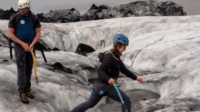
The geographical preference for Winter types leans toward dramatic, high-contrast landscapes, with Iceland serving as the definitive destination. The island’s geography—featuring black basalt beaches, crystalline glaciers, and the neon-green streaks of the Aurora Borealis—mirrors the Winter palette’s inherent drama. Destinations like the Solheimajokull Glacier and the Secret Lagoon in the geothermal village of Fludir provide the stark, cool-toned backgrounds that make Winter features "pop." Market research suggests that Winter travelers are often drawn to adventure tourism that emphasizes "elemental" experiences, seeking out the starkness of snow-covered vistas and the deep blues of volcanic lakes.
Spring: Vibrant Hues and the Renewal of the Atlantic Coast
The "Spring" palette is a collection of warm, bright, and clear colors. Individuals in this category often have golden or peach undertones, warm-hued hair such as strawberry blonde, and vibrant eyes in shades of blue or green. The Spring aesthetic is defined by energy and freshness, favoring colors like coral, turquoise, and bright yellows.
Portugal, particularly the Douro Valley and the Azores archipelago, is increasingly marketed toward those seeking a "Spring" atmosphere. The yellow-hued medieval villages and the lush, flower-studded landscapes of the mid-Atlantic islands provide the high-energy, warm-toned environment that suits this palette. The Azores, a nine-island archipelago, offers a unique combination of volcanic greens and bright floral exports, such as the famous pineapple plantations of São Miguel. This destination appeals to the Spring traveler’s desire for "freshness," both in scenery and in local gastronomy, such as the bright yellow, custard-filled pastéis de nata.
Economic and Psychological Implications of Aesthetic Travel
The integration of color analysis into travel planning is more than a superficial trend; it represents a significant evolution in the "Experience Economy." According to a 2023 report on consumer behavior, travelers are increasingly prioritizing "visual harmony" in their trips, driven in part by the desire for high-quality social media content. When a traveler feels that their environment complements their physical appearance, the psychological result is a heightened sense of belonging and "well-being" within the space.
Tourism boards are beginning to take note. Marketing campaigns are shifting from broad-spectrum appeals to more targeted, aesthetic-driven content. For example, Scandinavian tourism boards often utilize high-contrast, cool-toned imagery to attract "Winter" and "Summer" demographics, while Mediterranean and North African campaigns lean heavily into the warm, saturated "Autumn" and "Spring" palettes.
Chronology of the Trend Resurgence
- 1980: Carole Jackson publishes Color Me Beautiful, formalizing the four-season system.
- 2020-2021: During global lockdowns, interest in self-optimization and personal grooming spikes; DIY color analysis filters begin appearing on social media.
- 2022: Professional color analysis goes viral in South Korea, becoming a "must-do" tourist activity for visitors to Seoul.
- 2023: Major travel operators, including Intrepid Travel, begin linking destination recommendations to color palettes, recognizing the overlap between personal identity and travel choices.
- 2024: "Aesthetic Travel" becomes a recognized niche in the luxury and experiential travel markets, with influencers curating entire wardrobes and itineraries based on seasonal color harmony.
Expert Perspectives and Industry Outlook
While some critics argue that choosing a destination based on a color palette is a peak example of "Instagram-centric" vanity, travel psychologists suggest a deeper connection. Dr. Elena Rossi, a consultant in environmental psychology, notes, "Humans have an innate response to color and light. When we are in environments that reflect our internal or physical ‘temperature,’ we experience lower cortisol levels. The color analysis trend in travel is essentially a simplified way for people to find environments where they feel neurologically ‘at home.’"
As the travel industry continues to recover and evolve in a post-pandemic landscape, personalization remains the most valuable commodity. By leveraging the principles of color theory, travel providers are offering consumers a new way to navigate the world—one that promises not just new sights, but a harmonious reflection of the self. Whether it is the muted greys of a Parisian morning or the high-contrast whites of an Icelandic glacier, the future of travel appears to be increasingly colorful, personalized, and meticulously analyzed.