How the Viral Color-Analysis Trend is Redefining Global Tourism and Destination Marketing

The intersection of personal styling and global tourism has entered a novel phase as travelers increasingly utilize color analysis—a diagnostic aesthetic framework rooted in 1980s fashion theory—to select their vacation destinations. Originally popularized by Carole Jackson’s seminal 1980 book Color Me Beautiful, color analysis has experienced a massive resurgence across digital platforms like TikTok, accumulating billions of views under the #coloranalysis hashtag. Historically used to dictate personal wardrobes and makeup palettes based on an individual’s natural hair, eye, and skin undertones, this methodology is now transcending closets. Tour operators, hospitality groups, and travel agencies are reporting a distinct shift in consumer behavior, with modern tourists deliberately matching their personal seasonal color palettes—winter, spring, summer, or autumn—to the geographical landscapes, architectural hues, and natural lighting of international destinations.
The resurgence of this aesthetic phenomenon is not merely a fleeting social media fad; it represents a broader psychological shift toward intentional, hyper-personalized consumer habits in the post-pandemic travel economy. Travel industry analysts note that modern consumers are increasingly seeking out vacations that offer deep personal resonance and aesthetic alignment. By mapping personal color profiles to external environments, travelers are leveraging destination curation as an extension of self-expression. This trend reflects a sophisticated evolution in experiential tourism, moving beyond traditional demographic-based marketing to tap into psychographic and chromatic compatibility.
Historical Evolution: From Impressionist Theory to TikTok Virality
To understand the current integration of color analysis into modern tourism, one must examine the chronology of chromatic theory. The foundational concepts of seasonal color harmonies can be traced back to the 19th-century Impressionist painters, who meticulously studied how natural light interacts with environmental tones and human subjects. Impressionists recognized that human beings are fundamentally embedded within the natural world, prompting early observations that human physical traits naturally align with seasonal spectrums.
Decades later, in 1980, consultant Carole Jackson codified these observations into a structured methodology in Color Me Beautiful, introducing the four-season framework. Jackson’s system posited that individuals possess either cool or warm undertones, which dictate whether they harmonize best with the high-contrast drama of winter, the muted softness of summer, the rich earthiness of autumn, or the vibrant clarity of spring.
For decades, the practice remained confined to high-end consulting suites and department store styling sessions. However, the advent of short-form video platforms dramatically democratized the process. Throughout the early 2020s, artificial intelligence filters, digital drape simulations, and user-generated tutorials on TikTok propelled color analysis back into the cultural mainstream. Millions of users began diagnosing their own or professional color profiles online. As digital nomads and leisure travelers alike began documenting their journeys through visually curated lenses, the logical next step emerged: coordinating travel itineraries not just by budget or historical interest, but by whether a country’s natural color palette visually complements the traveler’s intrinsic complexion.
Summer Palettes and the Muted Landscapes of France
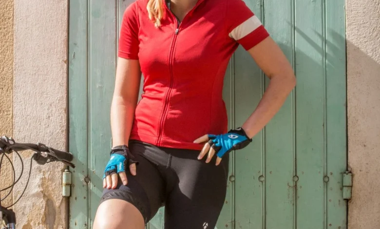
For individuals classified under the summer color palette—characterized by cool undertones, low-contrast features, light blue, grey, or soft hazel eyes, and ash-blonde to mousy brown hair—travel planning requires a deliberate avoidance of overly harsh or high-saturation environments. Summer types thrive in soft pastels, muted neutrals, and grey-infused tones that mirror the impressionist canvases of the 19th century.
Data from European tourism boards indicate a steady rise in slow-travel itineraries tailored to these aesthetic preferences. Travel planners note that summer-palette tourists frequently gravitate toward destinations such as the rolling hills of Provence, France, or the seaside communes of Normandy. These regions offer landscapes dominated by soft lavender fields, overcast skies casting gentle diffused light, and historic architecture defined by chalky stones and pale pastels. Tourism marketing experts observe that travelers exhibiting summer characteristics report higher psychological satisfaction and aesthetic fulfillment when visiting environments that do not visually overwhelm their low-contrast natural features.
Autumn Palettes: Deep Dives into Morocco’s Earthy Tones
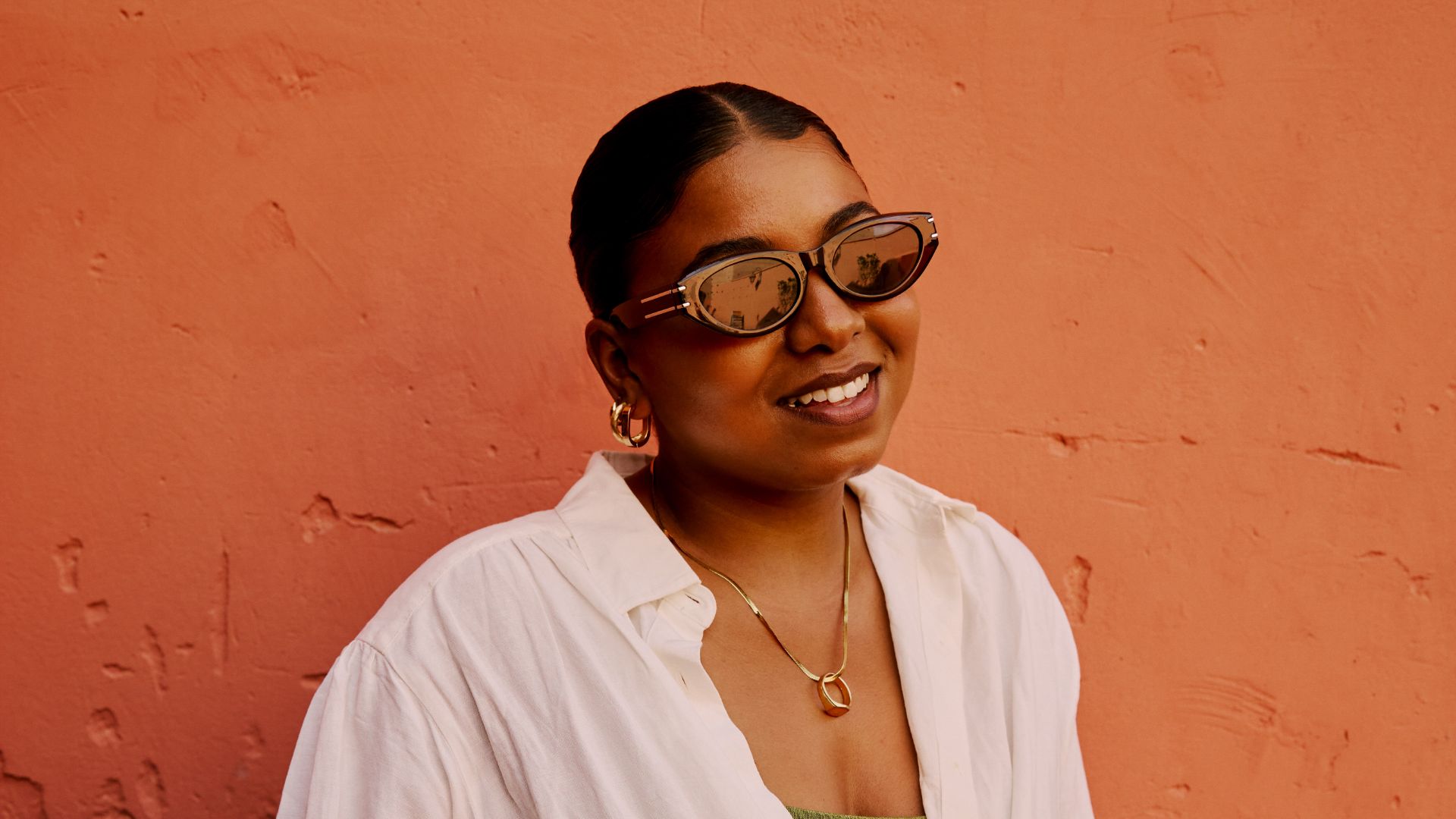
In stark contrast to the muted pastels of the summer typology, the autumn color palette is defined by rich, warm, and deep hues. Individuals falling into this category typically possess warm undertones—ranging from fair porcelain to deep bronze, olive, or melanin-rich skin—often accompanied by freckles, golden-blonde, copper, chocolate, or dark brown hair.
Travel industry data highlights North Africa, specifically Morocco, as a premier destination for autumn-palette travelers. The intricate, warm-toned architecture of Fes el Bali’s ancient medinas, paired with the rust-shaded dunes of the Sahara Desert, provides a seamless chromatic backdrop for autumn types. Tour operators offering immersive deep-dive itineraries through Morocco report that travelers with warm undertones consistently select these regions for cultural expeditions, citing an instinctive pull toward terracotta landscapes, golden-hour desert photography, and spice-market hues. From an analytical perspective, this alignment maximizes the visual cohesion of travel documentation, ensuring that tourists’ personal portraits and landscape photography exist in complete harmony.
Winter Palettes: High-Contrast Journeys Through Iceland
The winter color palette stands out as the only seasonal typology capable of effortlessly carrying high-contrast features, such as very fair skin paired with jet-black hair, or starkly contrasting dark eyes and pale complexions. Winter individuals thrive in environments characterized by high saturation, stark whites, pitch blacks, and deep jewel tones.
When applying color analysis to geography, winter types find their ultimate destination in the dramatic, contrasting landscapes of Iceland. Tourism analytics from the region demonstrate a robust demand for adventure tourism along Iceland’s Golden Circle, glacial hikes across the Sólheimajökull Glacier, and nocturnal viewings of the aurora borealis. The icy blues, volcanic black sands, and brilliant white frost provide the precise high-contrast environment required to make winter-palette features pop. Travel psychologists suggest that the inherent drama and mystery of polar landscapes resonate deeply with the psychological profile of the winter archetype, creating a powerful synergy between traveler and terrain.
Spring Palettes: Vibrant Exploration in Portugal
Spring represents the final cornerstone of the seasonal matrix. Characterized by warm undertones, golden or peach complexions, strawberry-blonde or golden-brown hair, and vibrant eyes in shades of bright blue, hazel, or green, spring individuals blossom when surrounded by warm, clear, and luminous colorways.
For travelers matching the spring profile, Iberian destinations such as Portugal have emerged as top recommendations within the adventure travel sector. Itineraries winding through the yellow-hued medieval villages of the Douro Valley, coupled with extensions into the mid-Atlantic Azores archipelago, offer the lush, flower-studded landscapes and vibrant culinary hues—such as the bright custard yellows of traditional pastéis de nata—that appeal directly to the spring aesthetic. Travel industry experts emphasize that Portugal’s geographic and botanical diversity provides an ideal playground for tourists seeking chromatic invigoration.
Broader Economic Implications and Industry Analysis
The integration of color analysis into mainstream travel planning reflects a broader transformation in how tourism products are packaged and marketed. Rather than relying solely on traditional demographic metrics such as age, income, or family status, forward-thinking tour operators are increasingly utilizing psychographic profiling and visual psychology to design specialized itineraries.
Industry analysts suggest that this trend points toward a permanent evolution in consumer behavior. As travelers become more visually literate and self-aware regarding personal branding and aesthetic harmony, destinations that can successfully market their natural chromatic identities—whether it is the glacial blues of an Icelandic winter or the terracotta warmth of a Moroccan autumn—will capture an increasingly discerning segment of the global tourism market. Ultimately, the fusion of color analysis and travel curation transforms a standard vacation into a deeply personalized, highly photogenic journey of self-actualization.